 by
by Have you ever wondered or asked yourself what are responsive web designs and why are they gaining popularity? As the name suggests a responsive web design is a concept whereby a designer develops a web page that can seamlessly respond and/or even re-size itself as per the device it is being viewed on. So, whether it may be a large desktop computer monitor, a laptop, a tablet or even a smartphone the web design adapts to the size of the screen and responds as per the user’s choice.
Responsive web designs although was being talked about in 2012 but now has picked up and is now a hot topic to discuss in 2013. This is all because of the drastic increase in the number of smartphone users where websites are viewed on a relatively smaller screen. 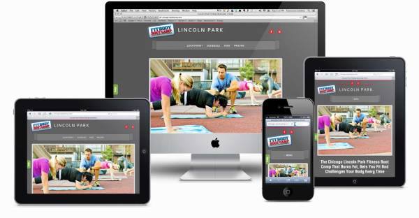
So, what does a responsive web design actually look like?
The main aim of having a responsive design is to be able to have one site but with a variety of elements that can respond differently as per the device and the size of the screen it is viewed on.
For a moment let’s take for example a traditional website. If this site is viewed on a desktop computer the site may show three distinct columns. However when the same site is viewed on a smaller tablet it may have to be scrolled considerably both in the horizontal and vertical directions. Some users hate doing this. In addition, a few elements that make up the website and as can be seen on the desktop monitor may not be visible on the tablet or smartphone. These elements could either be hidden or even distorted. If the smartphone screen is comparatively tiny then that could add onto the challenges. Large images may even destroy the overall layout and even the site could take ages to load on the smartphone particularly if the graphics are very heavy.
On the other hand if the site uses responsive design then it would adjust itself automatically on smaller screens to display two distinct columns. This way the content and the images are more legible and are easy to go through. On a smartphone the content could even appear in a single column and get stacked up vertically. Images would re-size themselves instead of getting distorted or missing altogether.
How does the concept of responsive web design work?
Responsive sites use what is known as fluid grids. The page elements are usually sized by proportion and not in pixels. This is how the columns tend to adjust themselves. Popular media and graphics like images also re-size themselves accordingly. This is how the image can stay within its column and not get corrupt.
Why is it necessary for small businesses to switch to responsive web designs?
With more and more people using smartphones to browse through websites it is important that small businesses should switch to responsive web designs. This improves competitiveness and brand visibility. If you check your web traffic you would be shocked to witness that many visitors tend to visit your website through mobile browsers.
If you search on the internet you would discover that responsive design templates are almost available everywhere for purchase. You can choose a template that best suits your taste and goes with the nature of business and buy one for almost $50 or less. You can then hire a web developer who can further customize the template to your liking and add your brand logo.
How do responsive web design benefits web designers?
Responsive web designs are most beneficial for web designer, web developers and interface designers. This is because they need not have to work day in and day out to create websites for every single device. Listed below are a few key advantages:
- Be it a 27 inch iMac or an Android phone with 4G coverage, one website would suffice both machines. The website can be used for optimal viewing pleasure and the site would look just as good on both screens. The images would appear crystal clear and the content very much legible.
- The design would remain very much optimal for any device it is used on as the font and image quality as well as other HTML elements is scaled according to the size of the screen. In other words the elements would automatically adjust themselves on the screen.
- With responsive web designs there is no need for any redirects. For the traditional website at times redirects are required and the user is sent to the appropriate version of the web page. Since redirects are no longer in the picture so the user can seamlessly access content he wants to go through without any hassles.